Posts Tagged ‘facebook’

Redesigned Fuzzy Peach Frozen Yogurt Website

Tuesday, November 16th, 2010

The new design for The Fuzzy Peach, Wilmington, North Carolina’s premiere frozen yogurt bar, went live last night.  The new resembles the eatery itself with clean, open spaces.  The first thing you’ll notice on the homepage is a auto-scrolling 3D slideshow that lets you pause on one image or go back or forward to the next image, all shot by noted photographer Millie Holloman.

Social networking is prominent on the new design with prominent Facebook and Twitter icons at the top of each page as well as a Facebook plugin beneath the fold on the homepage.

You’ll notice as you go from one page to the next that the pages slide in transition instead of loading separately (with the exception of the store link, which goes off-site).  The location page sports an embedded interactive Google map.

We’re proud to have created the new Fuzzy Peach website.  The local yogurt bar that has been the talk of Wilmington now has a website to match its hype.

AttyDC.com Redesign

Monday, July 26th, 2010

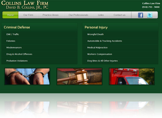
Wilmington NC Lawyer - Attorney David Collins

Venuecom and Impulse Web Designs teamed up to redesign www.attydc.com, the website for Wilmington, NC Lawyer, Attorney David Collins.  The client’s original website was designed from a phone book ad from six or more years ago.  Obviously, styles have changed since then and our first mockup was much more modern; a little too modern for Mr. Collins, who wanted to update the look, but keep it familiar.

The challenge was this: the existing website already ranked at the top of Google for the search term Wilmington NC lawyer, but it was not converting, so one of the points we emphasized in preparing this project was that the look of the site needed to be modernized and more engaging in order to hold the attention of visitors and thereby convert more traffic into leads.

Collins was pleased with the second mockup by designer Travis Ray.  We feel he designer tasked with this challenge did a great job of meshing the old, outdated look with a more modern, pleasing style in the second mockup.

In addition to aesthetic updates, over 200 unique pages were added to the site to help search engines index key service areas and locations targeted by the client.  Links to the client’s Twitter and Facebook accounts were also added and a WordPress blog is slated to appear soon in order to increase the site’s social media presence.