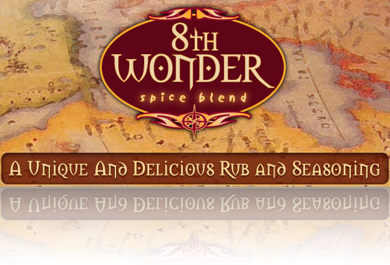
8th Wonder Redesigned
Wednesday, December 22nd, 2010I’ve been terribly remiss in not announcing Venuecom’s completion of the redesign of 8thWonderSpice.com, which is, in my opinion, one of the nicest sites we’ve built recently. (And, also in my opinion, that’s saying something.) I’ll chalk it up to Christmastime busy-ness, and I don’t mean shopping. We’ve been crazy busy lately.
At any rate, 8th Wonder started off as a very simple website several years ago. The owner just wanted an online presence, not much more than a holding page, so he got a website with his logo at the top, a patterned background and a few pages. I meant to save a copy of it so I could do another before-and-after video, but I didn’t manage to grab it in time.
Anyway, 8th Wonder was ready to start making a big push and needed a more professional design and the ability to sell their product online. We wanted to build on the branding established in the company’s name and the beautiful (seriously, very nice) tins the spice comes packaged in to create an old world feel for the website.
Aside from the upgraded design, the 8th Wonder Spice website features a growing list of recipes with which to use the spice and an also-growing list of retailers where you can purchase the product. If you’re unable to buy find a local retailer, you also have the option of buying the spice or refills (because seriously, the tins are nice and you won’t want to throw them away) online.
Check out the site and feel free to leave some feedback in our comments section.

